 3 weeks ago
12
3 weeks ago
12
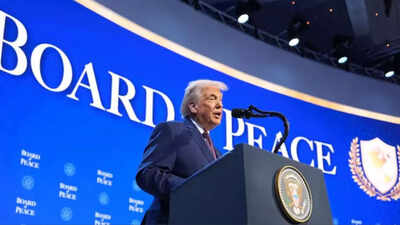
US President Donald Trump on Thursday launched his "Board of Peace", initially designed to help stabilise Gaza’s fragile ceasefire but which he has said could later take on a broader role in addressing international conflicts.
The initiative includes a controversial USD 1 billion fee for countries seeking permanent membership.The initiative was announced during a signing ceremony at the World Economic Forum in Davos on Thursday. Trump said the board is meant to establish an alternative mechanism for conflict resolution beyond existing multilateral institutions. However, it was the organisation’s logo that quickly became the focus of public attention, triggering sharp reactions across social media.
What the Board of Peace logo shows
The Board of Peace logo combines a shield, a laurel wreath, and a globe centered on the Americas.Together, these symbols suggest that peace is something to be protected and enforced, rather than simply negotiated. The shield and laurel wreath: historically associated with defence, victory, and authority, evoke strength and power, while the dominant gold color palette emphasises prestige, permanence, and control.

Although the globe implies a global mission, its focus on North and South America highlights a distinctly US-led worldview, reinforcing the idea of peace shaped through American leadership rather than multilateral consensus.
Social media reacts
The logo has triggered sharp reactions across social media platforms, with many users mocking its design and symbolism.Reacting to the logo, one user wrote: Trump’s ‘Board of Peace’ logo is basically the UN logo, except dipped in gold and edited so the world only includes America.”


 English (US) ·